
Masks On, Williamstown!
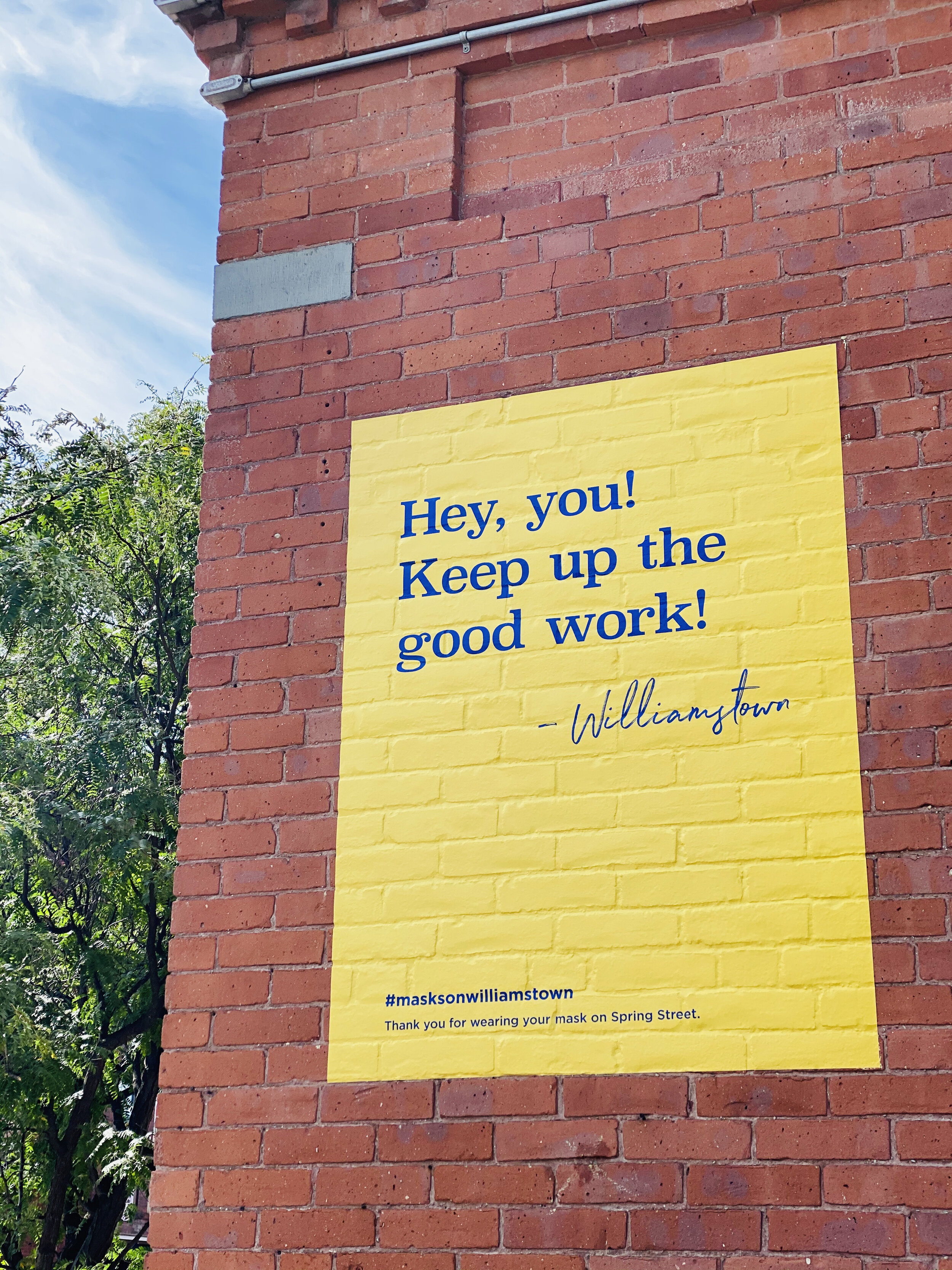
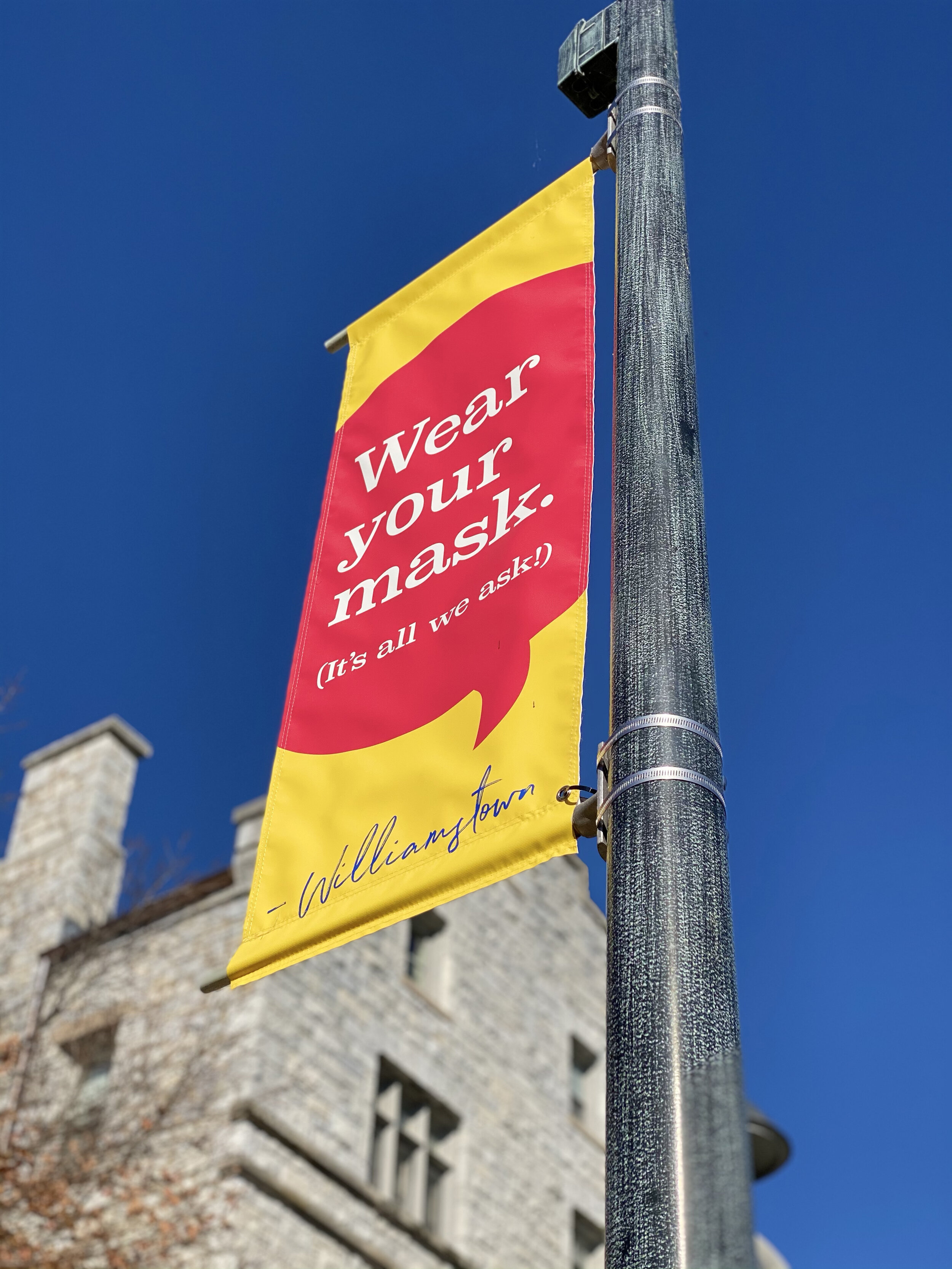
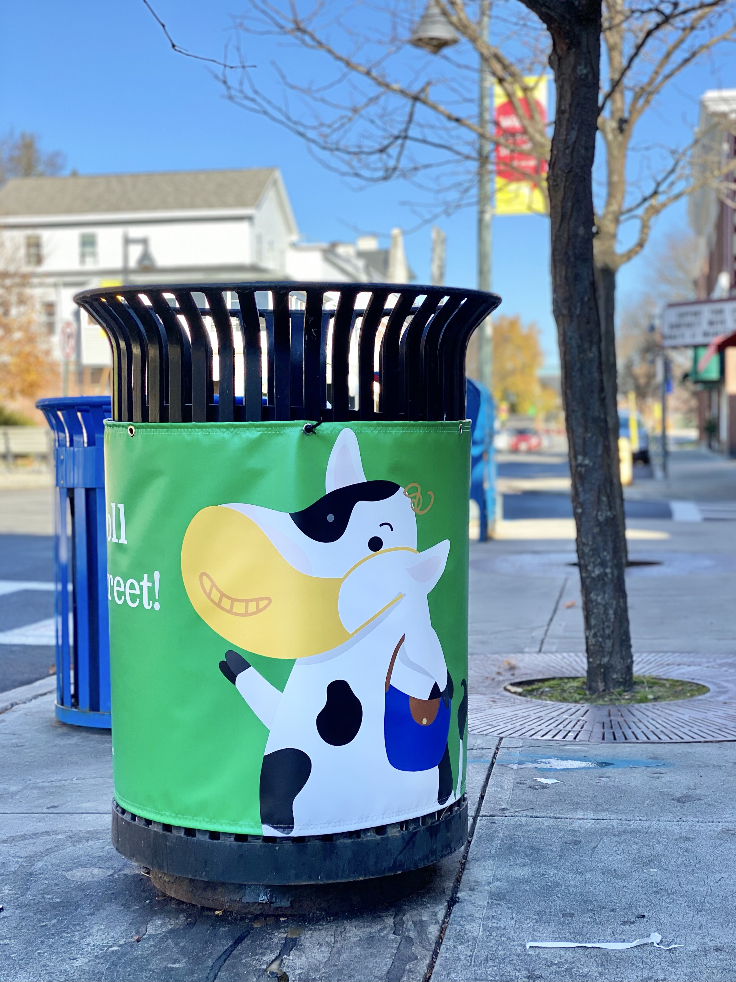
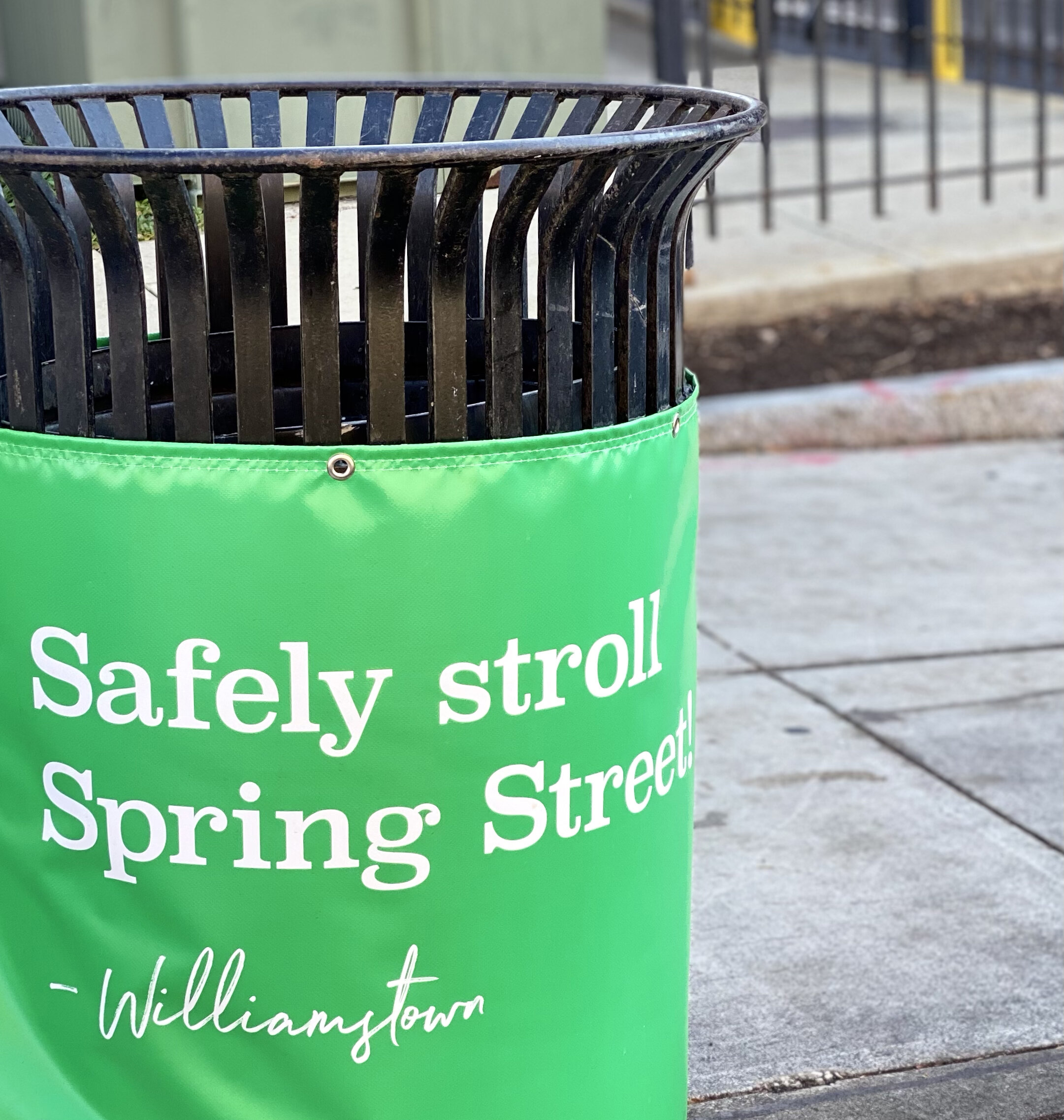
This past fall, I collaborated with the Williamstown, MA Board of Health to launch the “Masks On, Williamstown!” campaign on Spring Street. In the heart of Williamstown and just steps from Williams College, Spring Street is a popular byway for pedestrians of all ages. Recognizing that the community had been bombarded with warnings and safety rules as a result of COVID-19, I developed a friendly and inclusive approach to the mask-wearing mission. Bright yellow “notes” were applied to brick buildings with complimentary messages like, “That mask looks great on you!” Colorful banners were installed from light posts and garbage cans were wrapped with (masked) cows offering humorous tips to pedestrians. We’re aiming for a community-wide, mask-wearing, movement… and if we gain a few smiles along the way, it’s a win-win.

Williams College
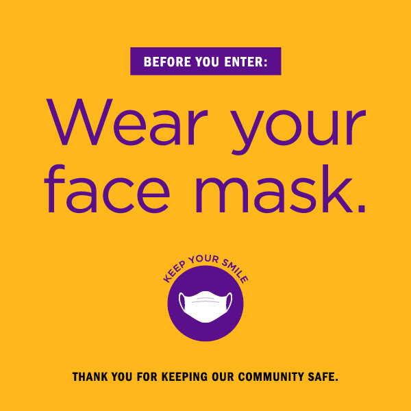
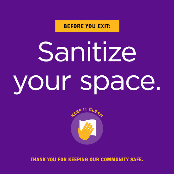
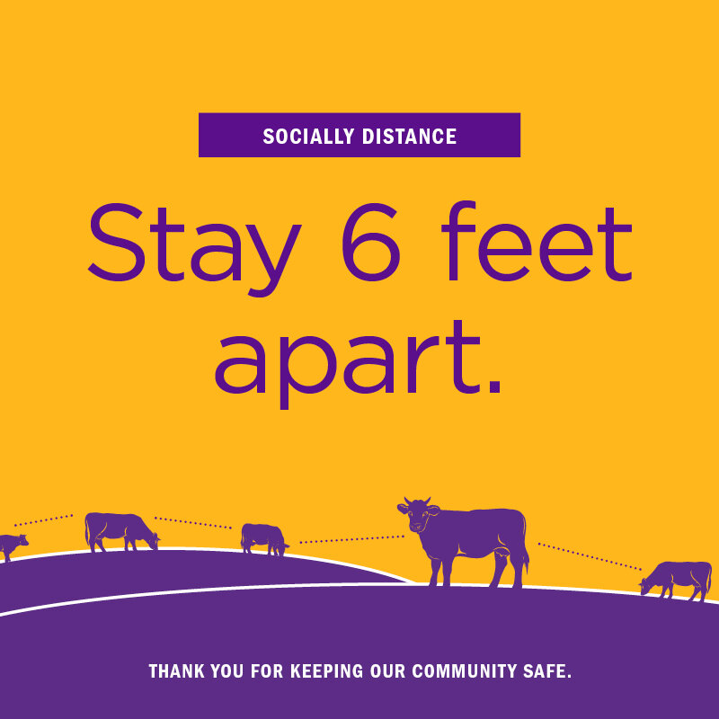
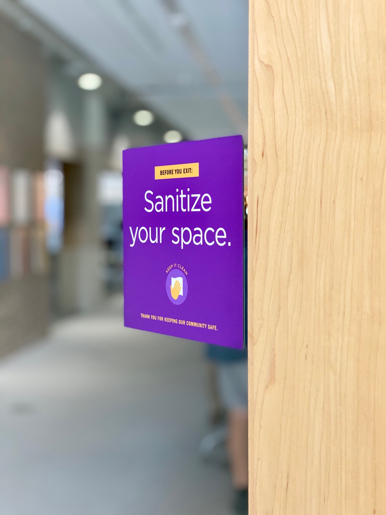
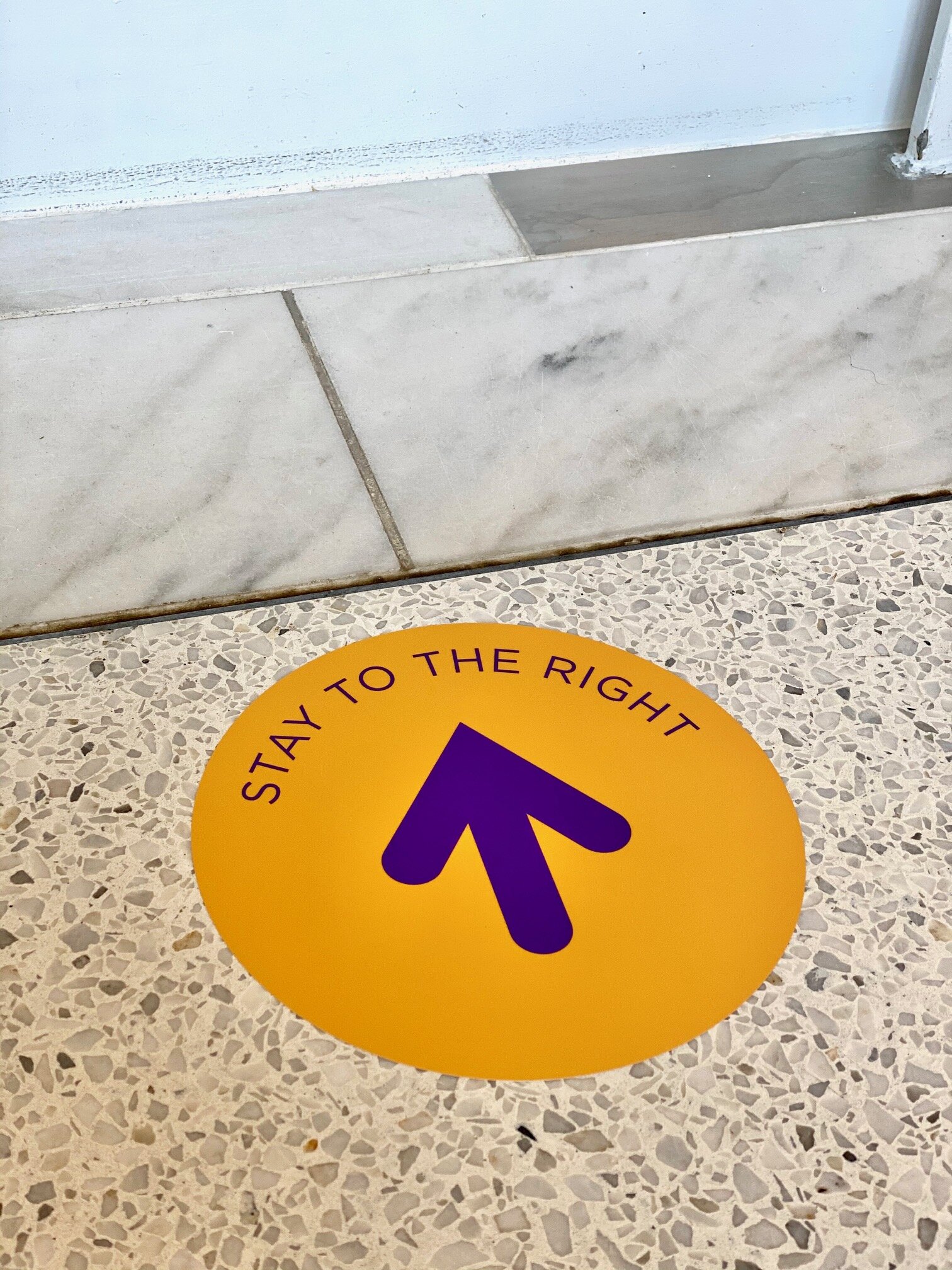
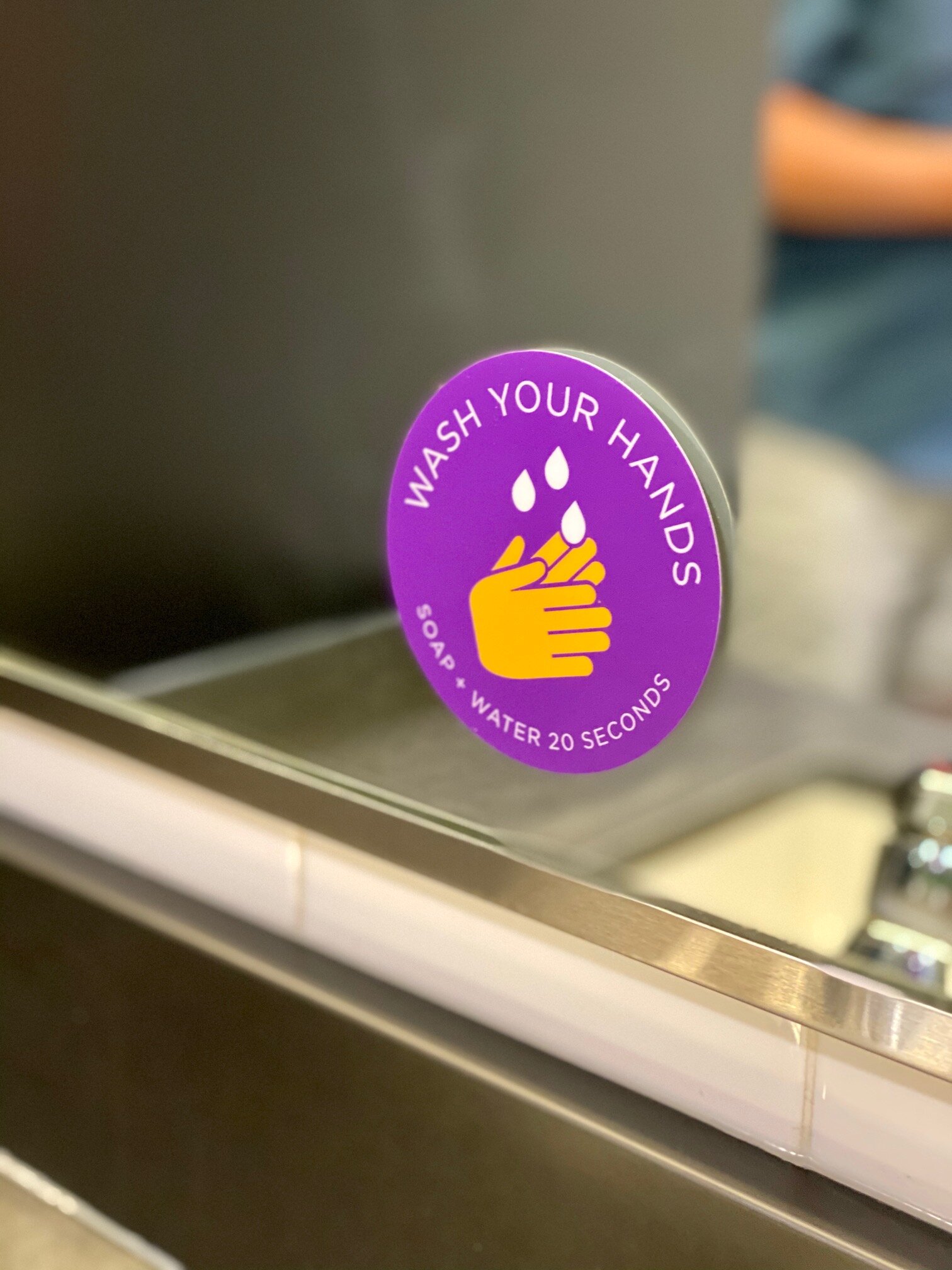
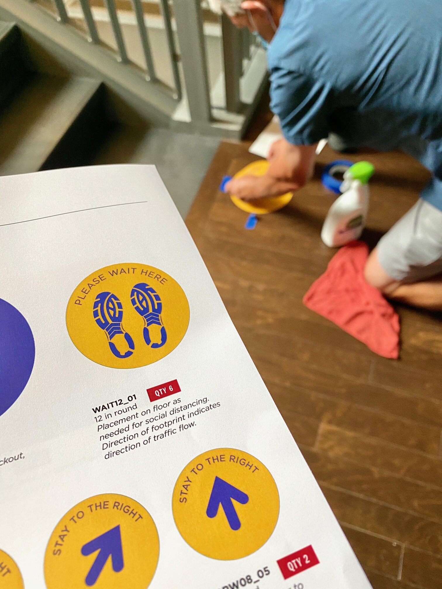
I designed and implemented health and safety messaging for the Williams College campus as a result of COVID-19. Wayfinding signage guides the community to proper entrances and exits, reminders to wear face masks and sanitize workspaces grace the doors to classrooms, “wait here” queues are properly positioned six-feet-apart on floors, and “wash hand” decals are applied to every bathroom mirror. We conquered every space, from elevators to facility refrigerators, to encourage a new way of life that keeps everyone on campus safe and healthy. The messaging is concise, yet friendly, with a strategic and Williams-branded color scheme. Every piece of signage is coded and cataloged for easy ordering and information on size, location and installation guidance.

SOCO CREAMERY
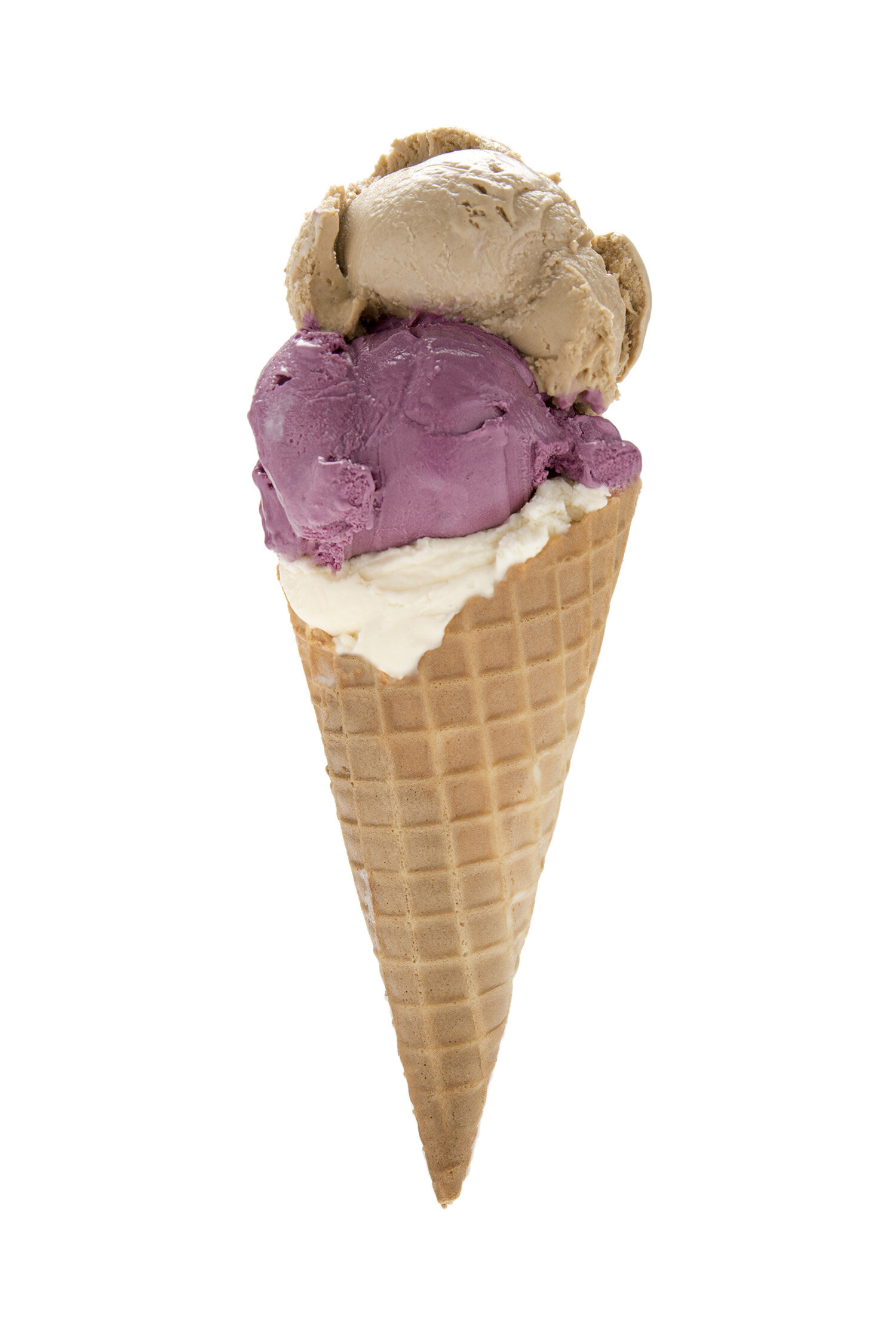
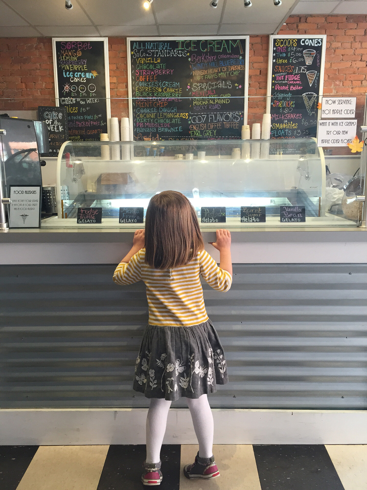
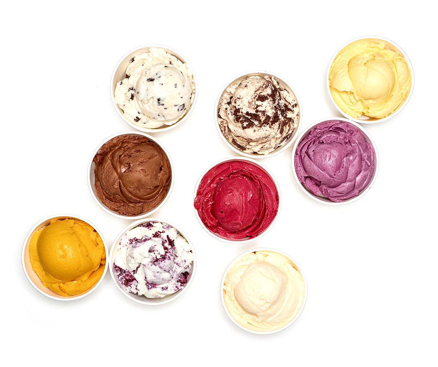
SoCo Creamery’s all-natural and award-winning ice cream is produced locally in the Berkshires. I’m fortunate to have played a role in building their brand, beginning with the design of their logo. I created designs for SoCo’s pints that were inspired by their clean, modern flavors. From signage and in-store displays to freezer carts, packaging and photo shoots, working with SoCo was sweet!

PJ LIBARY PROOF MAGAZINE
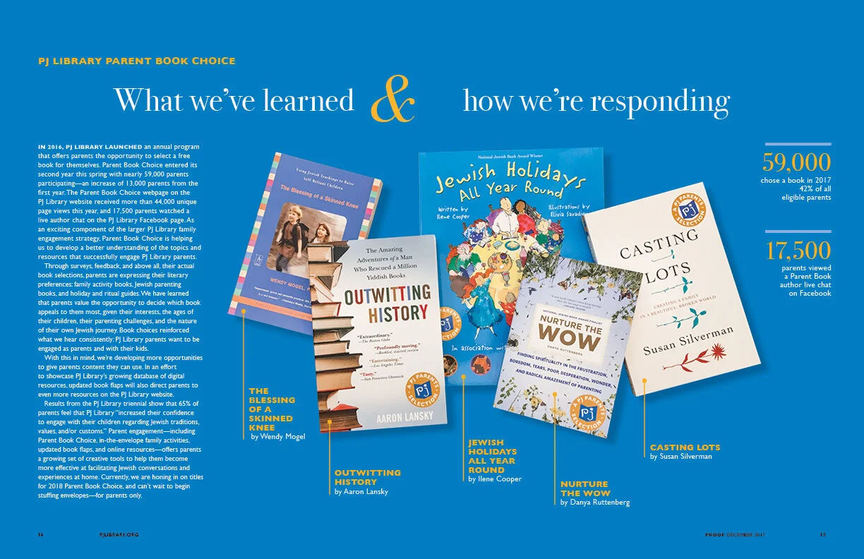
Proof is a bright and cheerful magazine for PJ Library’s community of supporters. Whimsical illustrations and infographics complement the news, book recommendations, and articles, making the magazine a fun read!


OOMA TESORO’s
It’s the most delicious marinara sauce in a jar! When designing for Ooma Tesoro’s, I get to craft fresh and fun illustrative designs that bring life to their market displays and collateral. From postcards to ‘Ooma swag’ to designs for their delivery van, I get to roll up my sleeves, wear my illustrator hat and have some fun!


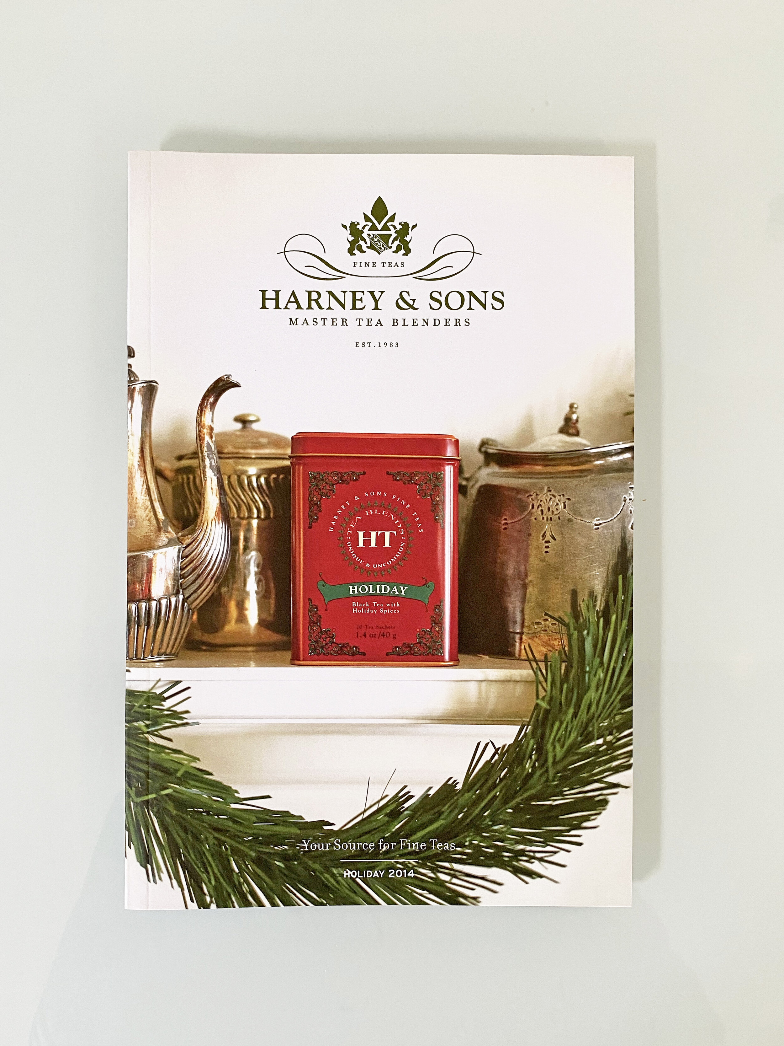
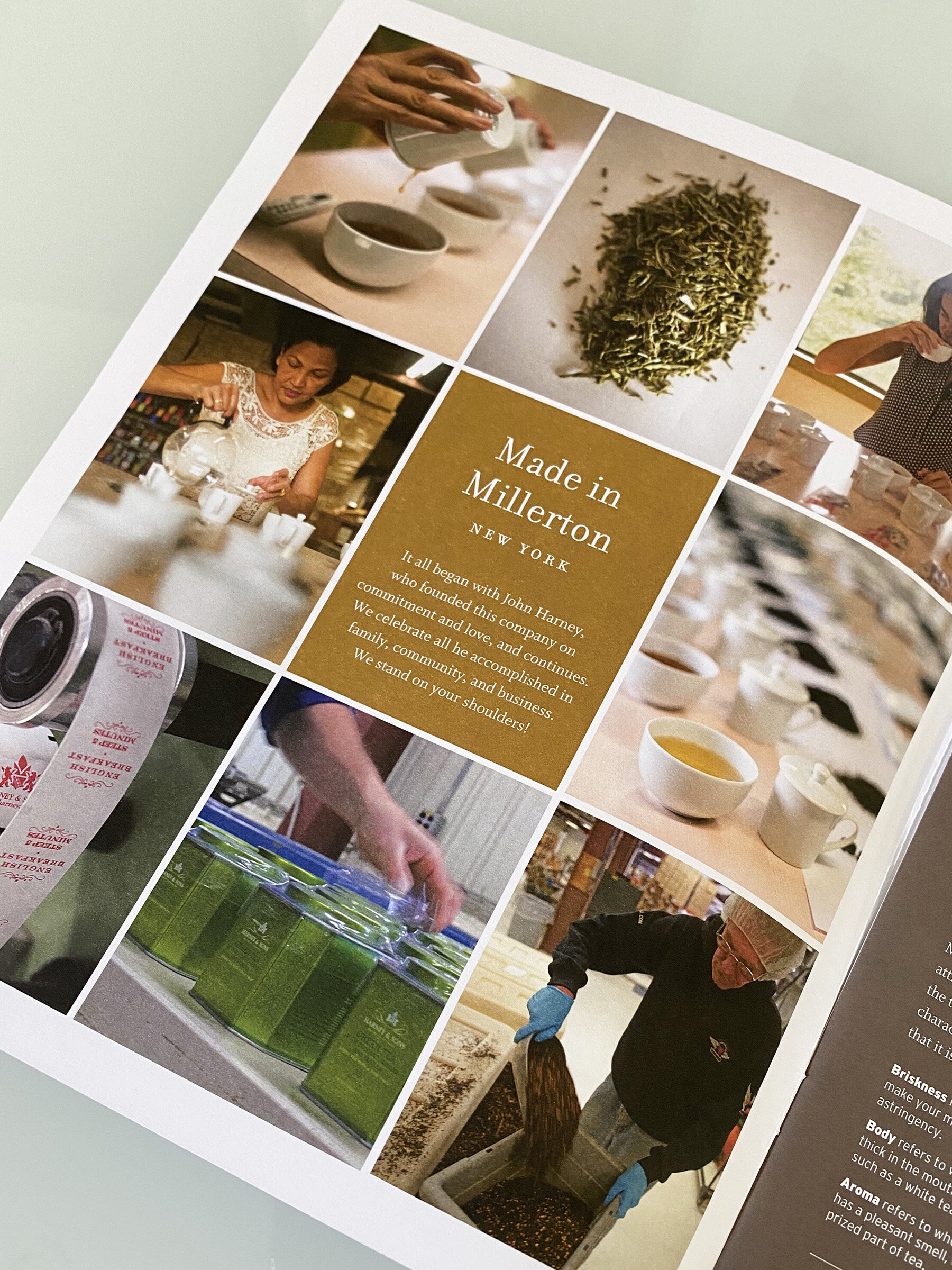
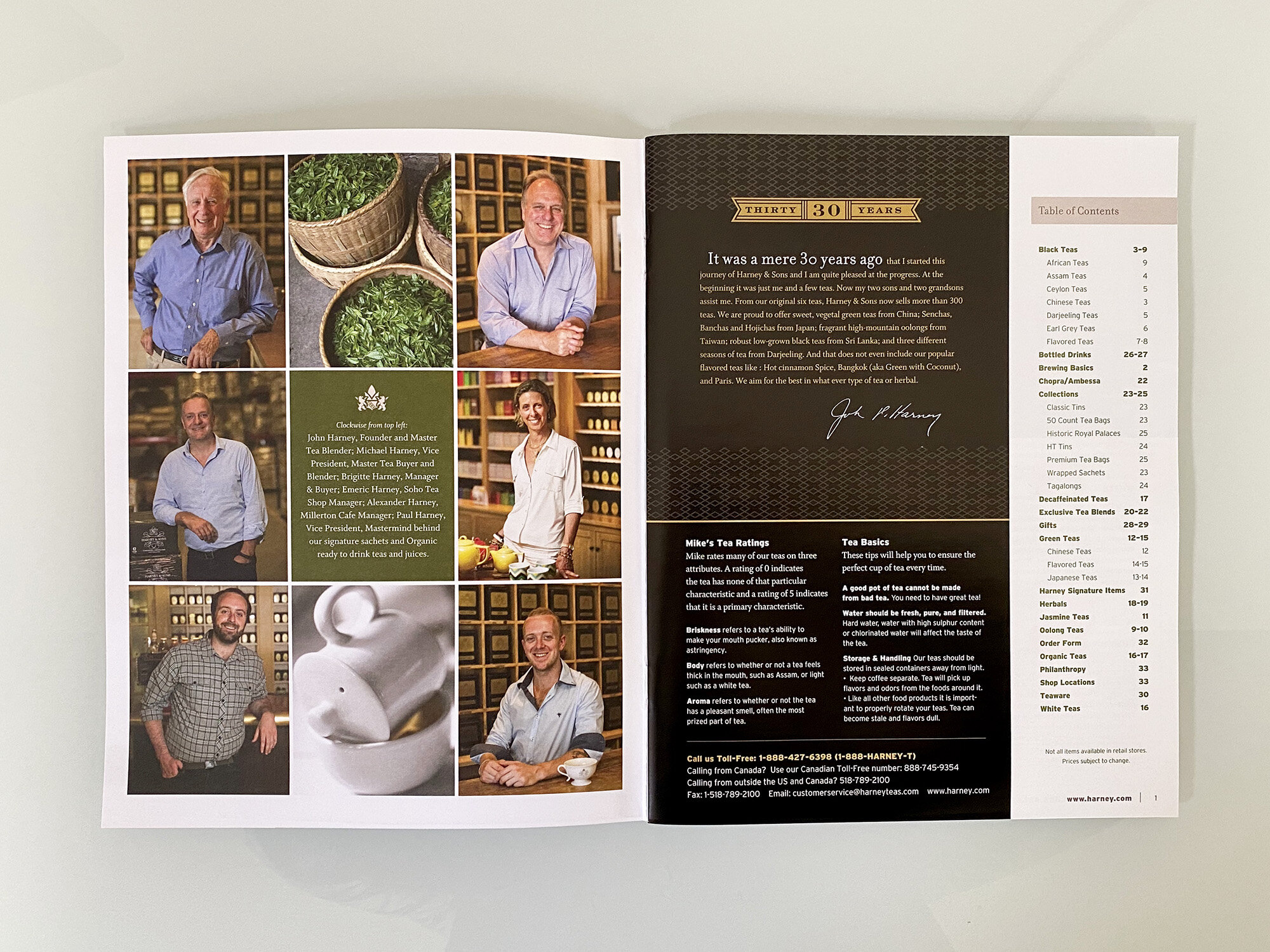
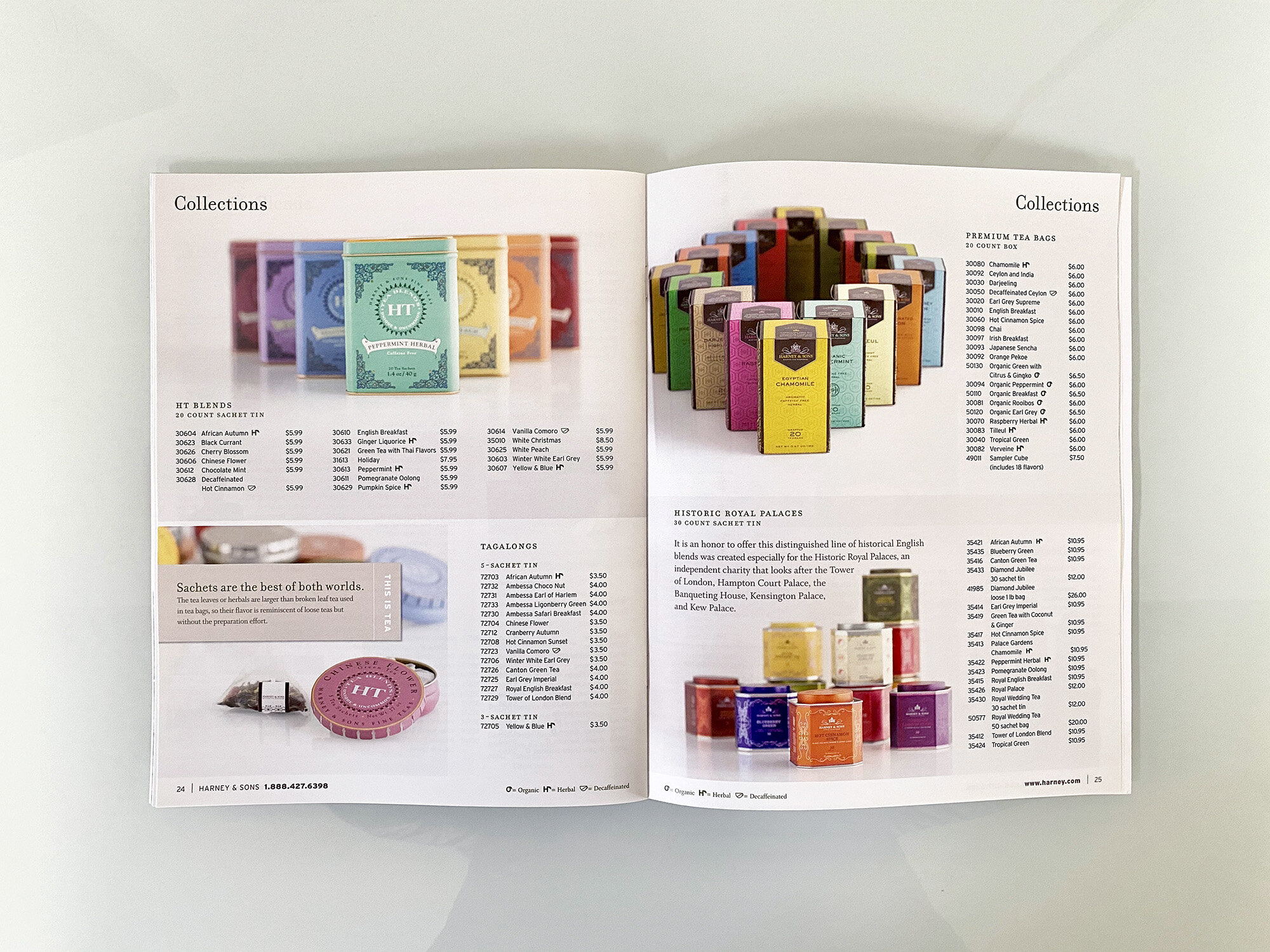
HARNEY & SONS FINE TEAs
In collaboration with the Harney & Sons team, I redesigned Harney’s product catalogs, with the goal of educating and inspiring. We incorporated beautiful new photography, educational maps, travel photos and mini-stories into the design. Updated fonts, icons to identify specific products, and a fresh layout modernized the catalog while retaining a classic style to honor the tradition of tea blending. In addition, I designed seasonal and holiday mailers that feature gifts and a curated selection of products.